For those who have already updated to Beta 4, you must have discovered at least one change in the UI. There are a lot of minor changes in Beta 4 to make iOS and iPadOS more refined and perfect. The Features & Changes are listed below:
1. Recovery of Storage: Users are reporting that they gained back a significant amount of storage back after updating to iOS 13. Congratulations to you if you have got back some storage.
2. Stutters: In Beta 3, there was a stutter while going to the app switcher. In Beta 4, it’s fixed and not just in the app switcher, stutters in the entire UI has been removed.
3. Performance: iOS 13 and iPadOS 13 Beta 4 Users are going to extremely happy using it because Beta 4 has increased stability and increased the speed of the overall UI.
4. Passcode Bypass fixed: In Beta 3 when you wanted to see safari saved passwords in the settings App, you could do it without a passcode authentication/Biometrics. This major security flaw has been fixed in Beta 4.
5. 3D Touch:
It’s back: 3D Touch is completely back in Beta 4, and there is no more delay in response when you 3D Touch on an app icon. The 3D Touch and Haptic Touch confusion is now over. The 3D Touch Platter/Menu has received a huge redesign. There are a lot of changes to the Menu which are:
a) You now have an option in the platter called “Rearrange Apps”. You can also rearrange apps now by 3D Touching on an app icon and moving the app while not releasing your finger will trigger Wiggle mode.
b) The new menu is now streamlined, smaller, sharper and denser and the background of the menu is no longer as translucent as Beta 3. Hmm… I don’t think many users will like that translucency is less in Beta 4.
c) Order of the options have also been changed for many apps. You will notice when 3D-Touching on the App Store, it will always show you the updates option regardless of whether you have updates or not. Also, the 4th row of apps now opens the 3D Touch platter upwards instead of downwards in Beta 4. Icons for the options have now moved from the left to the right.
Beta 3 on the left, Beta 4 on the right,
Source: EverythingApplePro
6. Volume HUD: The “volume” and the “speaker” text in the Volume HUD no longer has a shadow which gives it a cleaner look.
Beta 3 on the left, Beta 4 on the right,
Source: EverythingApplePro
7. Reachability: When you use reachability, you can now access the Notification Center in reachability. Earlier in Beta 3, you couldn’t bring down the notification center, you could only access Control Centre.
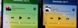
8. Music Platter: In the notification center, the volume bar gradually fills while you drag the volume bar in the Music Platter. Earlier in Beta 3, the whole volume bar was always filled in.
Beta 3 on the left, Beta 4 on the right,
Source: EverythingApplePro
9. Control Centre: In the voice memos platter, there is a new Play icon beside the voice memos instead of a notes icon.
Beta 3 on the left, Beta 4 on the right,
Source: EverythingApplePro
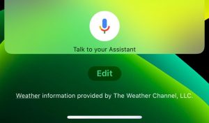
10. Widgets: On the bottom of the widgets page, you will notice that the “edit” icon has been reshaped. It looks like this now:
Beta 4, Source: iPhone, Sriyansa Mohanty, Appleosophy
Beta 3, Source: Holden Satterwhite, Appleosophy
11. Screenshots: The screenshot bug is now fixed. When you take a screenshot and tap on it, it no longer has a shrinking animation and is more static. When either The Screen option or the Full page option is selected, the bar is grey instead of black.
Beta 3 on the left, Beta 4 on the right,
Source: EverythingApplePro
12. Settings:
a) Search bar: When Dark Mode is enabled, the search bar is now discernable like it was on Beta 2 and it applies to all the search bars across the UI.
b) Space: A minor change in Settings is that options are more spaced out than in Beta 3.
Beta 3 on the left, Beta 4 on the right,
Source: EverythingApplePro
c) When you go Accessibility>Touch, you will notice that “3D Touch” has been replaced with “3D & Haptic Touch”. Going into this section greets us with a new option for Touch Duration in which you can change the response time to Slow or Fast according to your preferences.
d) When you set a new wallpaper in Settings, there is a subtle fade-in animation in this icon:
Also, While setting a Dynamic Wallpaper, you’ll notice that when you tap on the wallpaper, the actual bubbles are ready and zoomed and are not shown after a delay like it did not Beta 3.
13. System Fonts: The system Fonts in the entire OS has been shrunk and it is mostly reflected in the Notification Center. The text in the Notification Center has shrunken down a lot.
14. Messages:
a) In the Messages app, the voice recording icon has now been changed so as to not confuse it with the dictation icon in the keyboard.
Beta 3 on the left, Beta 4 on the right,
Source: EverythingApplePro
b)When you double tap on a conversation, now it triggers select mode.
c)You can now set different ear accessories in your left and right ear in memoji with the Mix and Match option.
d) When you 3D Touch on a conversation, you now get options to reply through Message, Call, Video, Mail and Apple pay while earlier you only had the option to quick reply and reply through messages.
15. Photos: In the Days Tab, the last photo on the screen will have a [ +(number of photos)]Â icon and if you tap on it, it will show you related photos. Also, while playing a video you can favorite it or delete it without pausing it which was not available on Beta 3.
Beta 3 on the left, Beta 4 on the right,
Source: EverythingApplePro
16. Share sheet:
a) When you tap share, there is a new and refined animation.
b) The options below used to gradient and the background used to be white in Beta 3 but now in Beta 4, its totally the opposite, the background is gradient and the options are white.
c) The AirDrop icon now has a shadow which helps you distinguish it from the background.
d) The x icon on the top has been updated.
e) When you tap on Manage, “Create Watch Face” and “Save to Files” cannot be turned off anymore
Beta 3 on the left, Beta 4 on the right,
Source: EverythingApplePro
17. Markup: The Markup interface has been tweaked a bit. it no longer has a bar running below it.
Beta 3 on the left, Beta 4 on the right,
Source: EverythingApplePro
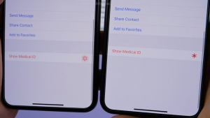
18. Contacts: The show medical ID Asterix in your contact is now filled in.
Beta 3 on the left, Beta 4 on the right,
Source: EverythingApplePro
19. Health: There are many new icons for the categories inside the Health App.
20. Activity App: There are new categories in the Trends tab which are Cardio Fitness, Stand Minutes and Running Pace.
21. Watch App: The interface has changed in the App Store tab. Now it features an Apple Watch Series 4 and the screenshot in it has also been changed.
Beta 3 on the left, Beta 4 on the right,
Source: EverythingApplePro
22. News: In the Following Tab, when you swipe all the way down, you will notice that Discover Channels & Topics has a new look.
Also, Now there is a separate option for Manage and under it is Notifications. Earlier in Beta 3, there was an option of Manage Notifications
23. Music: In the Now playing section, the three dotted menu option is no more highlighted in pink. Also when you are using live lyrics, the animation of the transition between songs have been changed and it’s no longer abrupt.
24. Clock: The Bed in the Bedtime splash screen is no longer orange in colour, rather it’s white.
25. Reminders: The options above the keyboard are no longer filled in with black.
26. Feedback: The options in the Feedback App now has larger icons.
Beta 3 on the left, Beta 4 on the right,
Source: EverythingApplePro
27. YouTube: For the users who have been having problems with the YouTube App, it’s has now been fixed in Beta 4.
28. Floating Keyboard: The floating Keyboard on iPadOS is now rounded off from the corners
29. Maps: You can now see Stop lights (Traffic Signals) on your route which is super convenient.
Source: EverythingApplePro
Happy Updating! We will keep you updated about more changes in Beta 4.
Please join us at our Appleosophy Community Channel on Telegram. Click here to join:Â http://t.me/appleosophycommunity


