Music streaming service Spotify has redesigned its app for Mac, Desktop, and web apps.
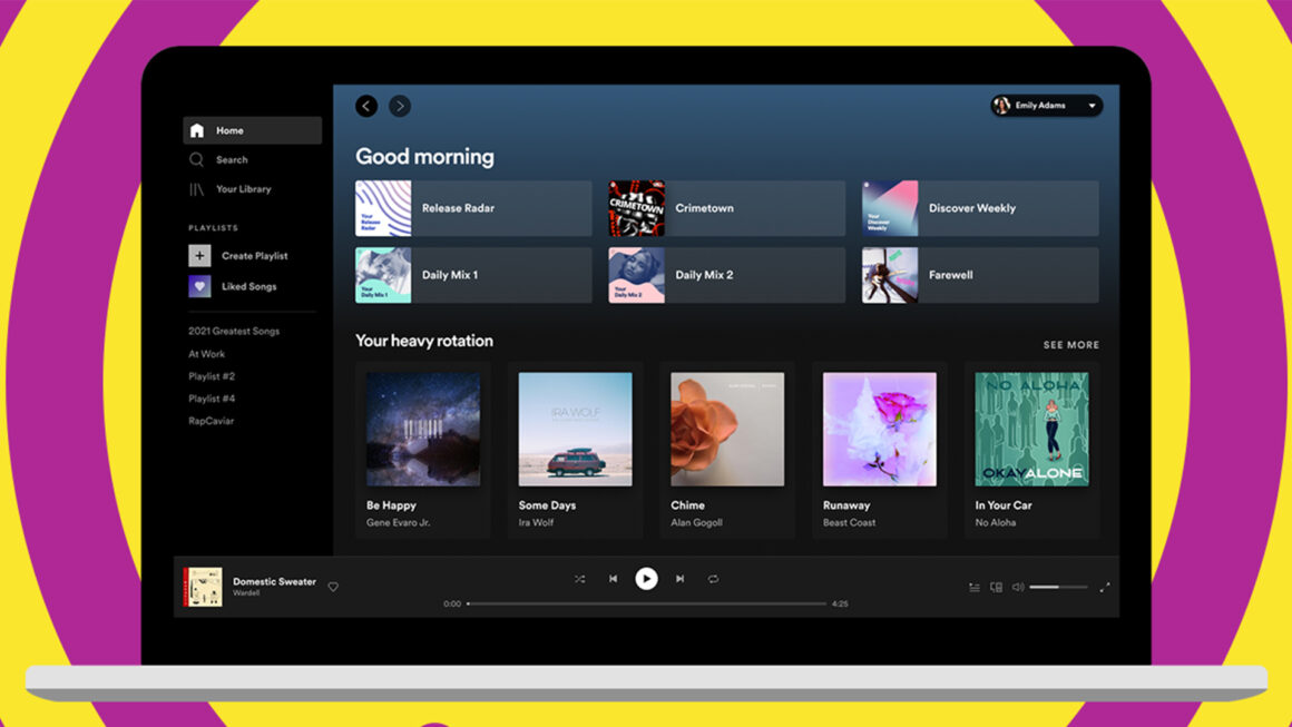
In a blog posted today, Spotify has announced that it has redesigned its Desktop and web apps, making navigation much easier and more like the mobile design.

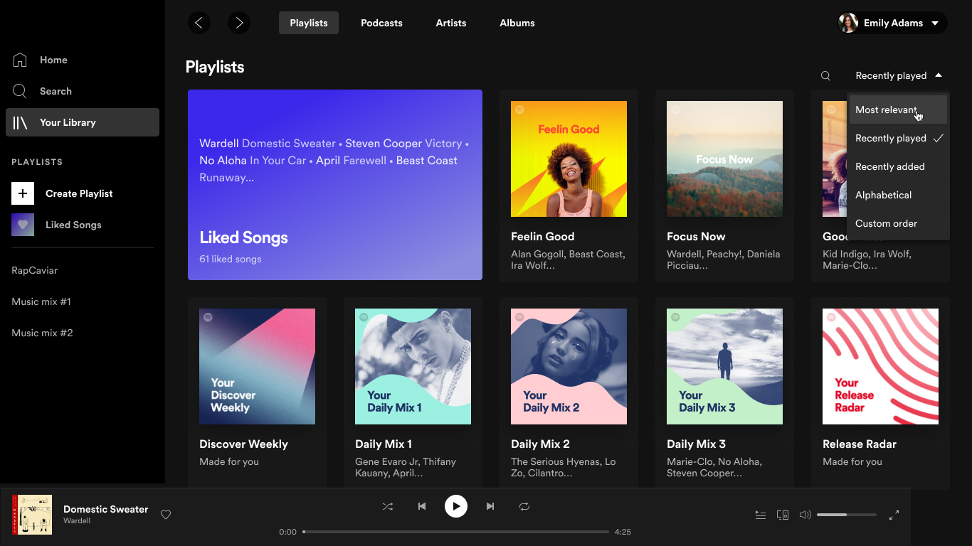
The new design is much cleaner and simpler than the older one, with tabs for Home, Search, and Library, Playlists, and Mixes on the left side. The player is still on the bottom with the listener profile on the top right corner showing top tracks and artists. Also, a function for dragging and dropping songs to your playlist is also added.
“Since the desktop experience served as the original window to the world for Spotify, this was not a task we took lightly. It took months of tests and research, talking to users, and gathering feedback. Now, we’re pleased to deliver a new, clean design, more controls, and a great new foundation for our listeners to use Spotify across our desktop app and web player for the years to come.”
Other features in the redesign include:
- Simpler playlist creation and more control:Â You can now search for songs in your playlist, viewing recently played tracks, new sporting options, and editing Queue.
- Save bandwidth with Offline:Â Spotify Premium users can download tracks and podcasts for offline use by clicking the download icon.
You can download Spotify’s Mac app here, or if you want to browse the app from the web, click here.


