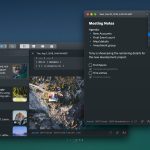
Day One for Mac, an app that we just reviewed last week in its previous version, has just been updated with a more elegant, sleeker and more prominent look in its new 3.0 update.
One of the reasons for this update is so that it looks like the third version of Day One for iOS that was released in August 2018.
According to Day One’s blog, here are just some of the new features coming to Day One for Mac:
- Toolbar:Â Journal pane toggle, Timeline filter, Journal picker, Search, Timeline view tab bar, and New entry button. All now cleaned up and available from the Main app toolbar.
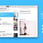
- Timeline Cells:Â Entry list now displays a single photo from the entry with overlay information for included media, photos, and audio.
- Entry View:Â Top bar includes date, with contextual, pop-out and dismiss buttons. Footer bar includes Journal, tags, location, weather and new Text Edit menu and Entry Content menu.
- Pane management:Â Entry pane is no longer collapsable, Journal Drawer is toggle-able and auto collapses at small sizes.
- Menu bar entry:Â Simpler design, with a pop-out button to open entry in a single-entry window.
- Journal info Page:Â Close an entry to see the selected journal information and stats.
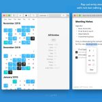
- Pop out entry:Â Double-click a Timeline entry, or click on the new popout button (top-right entry window) to keep as many single entries open outside of the main window.
- Contextual menus: Cleaned up and simplified.
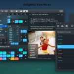
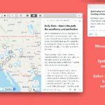
Here are some pictures in a slideshow from the Day One blog that show and highlight just what all of these features are what they look like in the app.
We do plan on doing a review of the new Day One 3.0 for Mac. Look for it to come later on this week.
Day One is currently a free app in the Mac App Store with in-app purchases for a subscription to Day One Premium. Prices can vary, but if you have any questions about it, please use this resource and hopefully all of that will answer your questions about the subscription costs to Day One Premium.


