This is a follow-up article to:
Features and Changes in iOS 13 and iPadOS Beta 2:Â http://https://appleosophy.com/2019/06/18/features-and-changes-in-ios-13-and-ipados-13-beta-2/
Here’s a list of more Features and Changes in iOS 13 and iPadOS 13 Beta 2:-
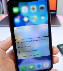
1. 3D Touch: With Beta 2, when you 3D Touch on an app icon, there will no more be a white bar in the Platter where the Name of the app is mentioned. You will be able to understand better with the images given below:
Beta 2, Source: iDeviceHelp
Beta 1, Source: iDeviceHelp
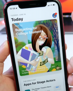
2. App Store: If you have Automatic App of any updates turned off, and if you have any app update from the App Store, there will be notification badge on the profile picture of the Apple ID whenever you have an update available. Have a look:
Source: iDeviceHelp
Also, there is a updated recently section below the App updates in the App Store.
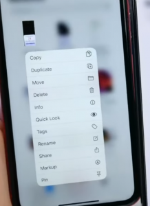
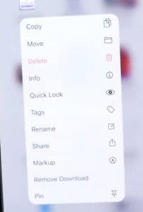
3. Files: If you 3D Touch on a File in the files app, there are additional options and some changes, which includes the Delete Button not being highlighted in Red, a new Duplicate option and we also see the removal of an option – Remove Download.
Beta 2, Source: iDeviceHelp
Beta 1, Source: iDeviceHelp
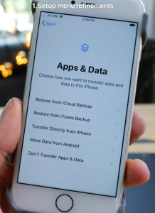
4. Setup Menu: The Setup Menu in iOS 13 received some changes, it is more bubblier-looking now, and it also has an option to Transfer Directly from iPhone.
Source: iDeviceHelp
5. New 3D Touch Sound: When you 3D Touch on an App icon or on any task, there is a new tick sound similar to the one we get when 3D Touching the Flashlight and the Camera Buttons in the Lockscreen of the iPhone.
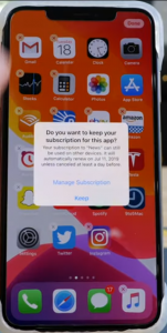
6. Subscription: When you Delete an App from the Home Screen which has an active subscription, it immediately shows a popup giving options to Keep the subscription or Manage the subscription.
Source: EverythingApplePro
7. WiFi: In the WiFi Menu in Settings, it now shows My networks instead of Known Networks in Beta 1
8. iCloud & Apple ID Settings: When you go to Settings and Tap on Your name in Beta 2, it shows you the Apple ID Settings Menu. Here, the icon for the iCloud Menu is missing and there is also a new option for Subscriptions.
9. Changes in the Graphical Representation of usage in Screen Time Settings. Also, the loading indicator is back in Screen Time when Swiping up to reload
10. New option for RTT/TTY in Accessibility Settings.
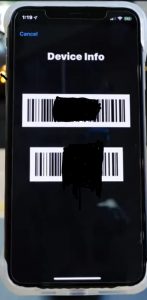
11. *#06# :- When you dial *#06# to get the device info, you’ll see something like this:
Source: EverythingApplePro
12. Contact Settings: The option ”Import Sim Contacts” has been added back to Beta 2, since it was removed in Beta 1
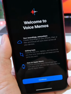
13. Voice Memos: In Beta 2, the controls for the Voice Memos App has become bigger and bolder. Also, when you tap on Share, you’ll notice that the Save To Files icon has been shrunk.
14. Notes: In Notes, when you tap on More, you now also get A cancel option . Earlier in Beta 1, we had to tap on Select and then Cancel. Also, when Dark Mode is turned on, there is a new icon for ”Use Light Background” option.
15. Ringer: Whenever you are on the Home screen, not playing any media, then the ringer Volume option slides down and shows you the correct volume of the ringer.
16. Music: In the Now Playing Tab in the Music App, if nothing is playing, you can actually tap on >> or << to go to the next track recommended or the last track you have heard.
17. Bug Fix: Earlier in Beta 1, When you go to Messages>Photos>All Photos, it used to show a White Screen. In Beta 2, it has been fixed.
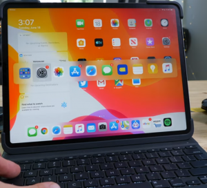
18. Command Typing: When you Use commands with your iPad Keyboard, there is a new Icon for the Home Screen. Here’s how it looks:
Source: EverythingApplePro
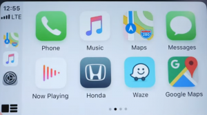
19. Carplay: There is a new and refreshed interface for Carplay and the Album Art now shows up in Now Playing.
Source: 9to5Mac, EverythingApplePro
The Now playing Icon on the homescreen has changed from a Bluish shade to a light red gradient
Source: EverythingApplePro
Also, the dashboard now mentions at what time you’ll reach your destination.
20. Screenshots: When you Take a screenshot and edit it, iPhone can now detect the Status Bar and when you move it downwards, the status bar immediately gets snapped, removed or cropped.
Source: EverythingApplePro


