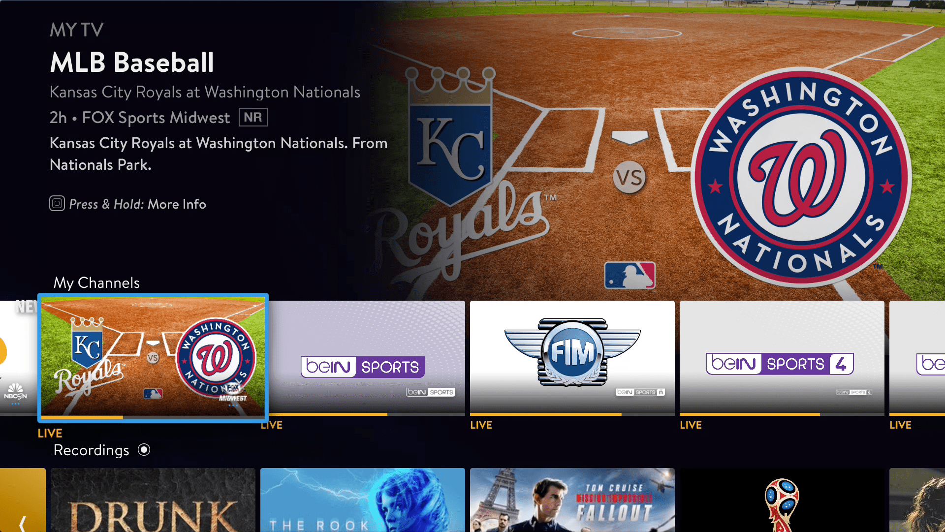
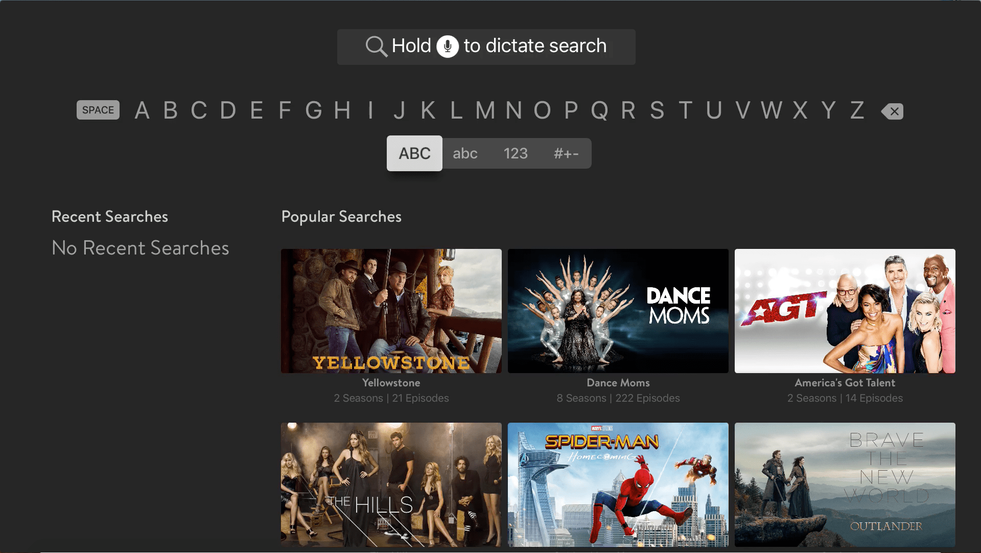
Last week, Sling TV received a new update for their tvOS Apple TV app that gave it a brand new interface.
What the interface does is that it does a better job of highlighting your favorite channels, the shows and content that are on them at the moment, as well as highlighting your favorite shows too.
When it does come to your favorite shows that you have listed on the service, it does a good job of showing them and the episodes you can watch on-demand, whereas previously it would do that, along with showing which episodes from certain seasons that would be airing soon.
The navigation of the UI looks very similar to that of the Amazon Fire TV streaming devices and Netflix. Sling TV’s version of it just shows more of the content and channels you watch to watch over things like menus.
Overall, it is still pretty easy to use, which is something Sling TV has been known for over the years for their interface on all of their devices that they support.
Sling TV is available on its Sling Orange or Sling Blue plans, both of which cost $25 a month and can have Extras added to them for additional costs per month too. It is available on the iPhone, iPod Touch, iPad, Apple TV and Mac.


