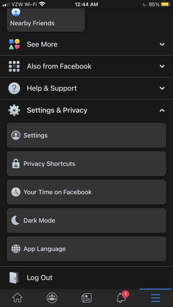
Over the last couple of weeks, I have had the opportunity to check out the new Dark Mode feature on Facebook for the iPhone. Previously, I only had it available on my MacBook Pro.
I’ll admit that this is an update I wanted for several months since I use my iPhone, iPad and Mac in Dark Mode, which makes the experience on those devices much better.
When you spend a lot of your day in front of a screen, at least your iPhone, iPad, apps and some of the websites you visit have the decent to give you. screen that is not blaring in your face.
This is exactly what Dark Mode on Facebook for iPhone accomplishes. I can read my Facebook feed right from my dark bedroom in the evening, during the middle of the night or throughout the daylight of the day, my issues never get irritated from it.
The Space Gray-like color is a nice touch too since it is not all the way black, which could make it look too dark on your screen. While that may not be an issue for me immediately, it could be an issue over time.
In fact, the only issue that I have seen with Dark Mode on Facebook for iPhone is it is not available for everyone at this time. From what I have seen and read, support for it on other iPhones has become more apparent in November 2020, but is still not available for all users.
Another issue I have had is that it is not available on the iPad yet. I would have thought Facebook would have released for Dark Mode on iPad at the same time it would the iPhone, but that is not the case.
I’d also like to see a dark Facebook icon for those who have turned on Dark Mode in the app.
To turn on Dark Mode in the Facebook app, open it on your iPhone, go to the three bars in the bottom right-corner, scroll down to “Settings & Privacy” and tap on it.
If you see the option for Dark Mode there, you can turn it on. If it is not there, it means your account does not have support for it right now.
Dark Mode on Facebook is going to completely change the game for the look of of the social media service. The color and look of it is so close to perfection. It’s not too dark and it’s not too bright. It should be just what everyone is looking for.
The new feature gets 4/4 stars in my book. It sounds so simple to do, but since we have been waiting so long for this feature to go public, it feels like we need a grand celebration for it.
Unfortuantely, the coronavirus pandemic would pretty much scrap those plans.
Rating: 4/4 stars


