PLEX is quietly one of the most popular streaming apps in the App Store, and it’s about to get some changes.
The folks over at PLEX have recently announced on their blog that they have been testing out some new looks for the PLEX app, with those updates now being available in its tvOS app.
Here is what the streaming service company had to say about its newest ideas for its interface:
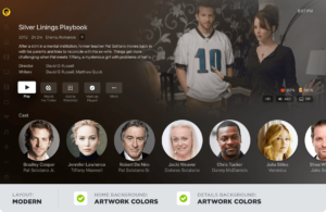
“First, we explored a large number of layout options, eventually landing on a new “Modern” layout that would showcase artwork from the title and provide some additional context when a poster is in focus: genres, parental ratings, and brief synopsis of the title without having to first click. We combined this rich data with a background color extraction process with a goal of providing a more immersive and streamlined experience when you’re sitting down at the couch and trying to figure out what to watch. Since posters generally have the movie or show title contained in the artwork, this layout also forgoes duplicating the (often truncated) text titles and additional information below the poster in favor of displaying that information in the “inline metadata” section at the top. Importantly, we wanted to involve the Plex community in the process and invite you into the lab.”
Once the results were received by PLEX users who were testing out the new interface, the conclusion from said testers was that they wanted “a more personalized experience” when using the app.
Now there is a “Classic” look for users to opt-in to and the new “Modern” look, as you can see from the images below.
Here are all of the changes that have been made to the app, according to PLEX.
- Content Layout:
This setting controls the layout used to display your content. Okay, so before you say “No, duh!”, this setting also controls whether “inline metadata” is displayed on the homescreen and the poster is displayed on detail pages.- Modern (the default): Displays artwork and “inline” details about the title on some screens when focused on a poster. This layout also prefers background artwork over posters on title detail pages.
- Classic: No “inline” metadata is shown, displays title and additional information below posters, and prefers posters to artwork on detail pages.
- App/Home Background:
This setting allows the user to select the base background of the app (i.e.: the background used for the home screen, settings, etc”¦).- Artwork Colors (the default): Applies colors from the current title’s artwork to the background and gracefully (we hope!) transitions the colorfield as the title selection changes.
- None: Displays the default background for the application (dark gradient).
- Details Background:
This setting controls the background displayed on the detail pages for items.- Artwork Colors (the default): Utilizes colors from the title’s artwork within the background on title detail pages.
- Dimmed Art: Displays a full screen, dimmed version of the background artwork on detail pages.
- None: The default background for the application is used for detail pages (dark gradient).
When it comes to making these changes for you in the app, it can all be done through the app’s settings and then going to Content Layout section to switch between Classic and Modern.


