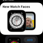
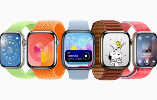
The public release of watchOS has reached the wrists of many Apple Watch users since it officially debuted yesterday. Along with this major update came two new Watch faces for Apple Watch Series 4 or later as well as the Apple Watch SE. Although we got relatively fewer watch faces compared to last year’s watchOS 7, I’d try a new watch face any day now. The new watch faces that watchOS 8 offers to existing Watch models are Portraits and World Time. As previously implied, for Series 3 users, you’re empty-handed when it comes to newer watch faces as those aforementioned watch faces are not designed or optimized for the smaller screen or outdated hardware.
Portraits
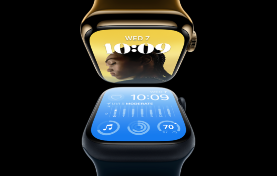
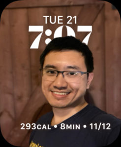
This fun and personal watch face puts the subject up front, whether it’s you, your friend, your pet, or even your favorite object. As you scroll the Digital Crown, the subject zooms in and out while the date/time/complication fades into view. All you need is an iPhone that  takes portrait photos via Portrait mode. Once you find a Portrait photo, in the Photos app on your iPhone, tap the Share button to create a Watch face. From there, you can select the ‘Portraits Watch Face’ and customize it to your liking. This watch face can feature a top complication that shows the calendar date as well as a bottom complication. The three styles for the time include Classic, Modern, and Rounded – all based on Apple’s San Francisco/New York typeface.
World Time
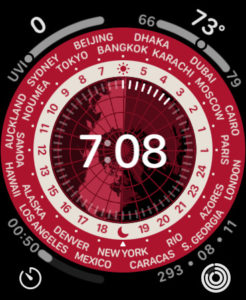
Inspired by traditional world time watches, this watch face provides the time across 24 time zones via the outer dial. The inner dial shows the current hour for each of the time zones as well as both the sunrise/sundown time. The center displays a globe that brings your time to the center. Tapping on the display will rotate the globe to either pole or to its axis of rotation. You can customize the time to either digital or analog to your liking along with four corner complications.
Other Tidbits
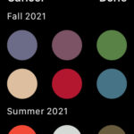
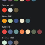
Customizing and adding watch faces has never been easier thanks to watchOS 8. Now you can easily find colors sorted by each season the colors were released and even select which colors based on your liking. With a large library of watch faces, Apple has made it easier to find you favorite watch face by initial letter when you scroll fast on the Digital Crown. Those improvements have also made it to the iPhone’s Watch app.
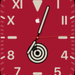
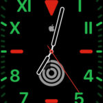
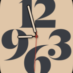
Additionally, while many watch faces get additional colors from this season, watchOS 8 provides very nice additional touches to at least the California and Typography watch faces. The California watch face gets a very special red/green/black color scheme that’s most likely inspired by both the Black Unity Sport Band and Watch face. Both of these watch faces actually have some of this season’s colors that entirely fill the background.
If you ask me what my favorite Watch face is, it’s certainly the California. Inspired by the original California watches, not only it’s really customizable, but also, it provides the best of both worlds with its inspired design that features both Roman and Arabic numbers. Even better, you can have both the analog/digital time as a complication to show if you set the dial to full screen. What is your favorite watch face?
Let us know in the comments below. Follow us on Twitter or Instagram. Also ”“ make sure to subscribe to our new video podcast on YouTube!


