
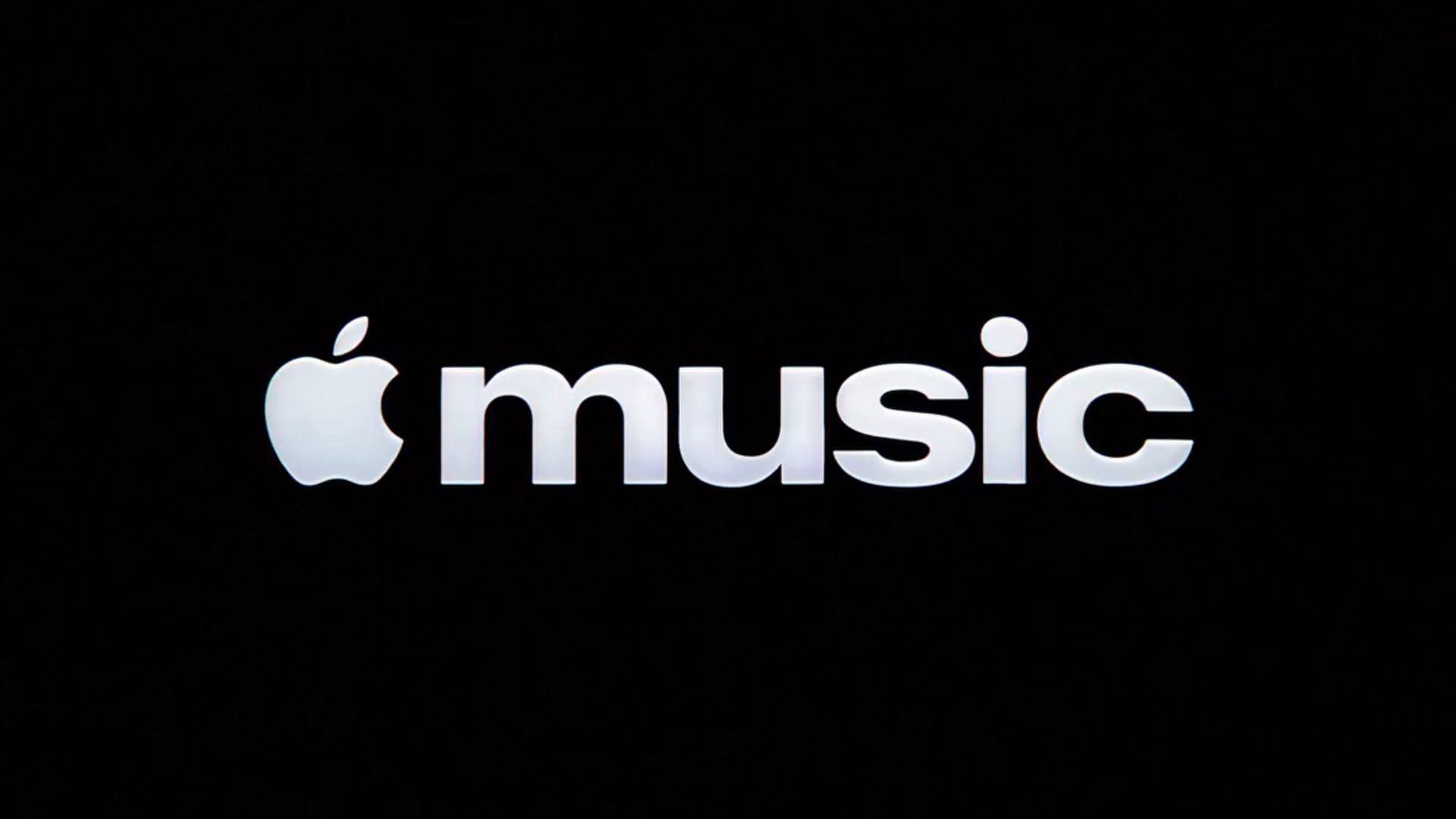
Apple Music is evolving. This time, Apple has officially launched its rebrand with a new logo and great design changes. The report says that the new design and features are inspired by sound, or “made by sound,” according to Apple. The announcement came through the official Apple Music account on X.
Introducing a new identity for Apple Music, physically shaped by an original composition from @fredagainagain1 and NEST Acoustics. pic.twitter.com/LFXLIfexPL
— Apple Music (@AppleMusic) October 21, 2026
The old Apple Music was entered around a red background with white font a simple yet elegant design. The Apple Music logo has not seen a change in years, even though the Apple TV logo was rebranded recently. The first sign of a change came in September 2026, when Apple showed a new logo with a bolder font and lowercase styling while announcing Apple Music Hall. Apple’s tagline for the changes is “Just music, made visible.” Not just the logo; the color of the tab bar has changed to blue, the widgets got darker, and so on. Just like Apple released the behind-the-scenes video showing how the Apple TV logo was rebranded, A new video has been shared by Apple unveiling how the logo evolved. The video features Fred Again and NEST Acoustics.
You can watch the full video here,
The changes are expected to reflect when iOS 27.2 launches next week. The new black and white icon, blue tab bar, and darker widgets all showed up in the beta release first, so there could be changes before the release. The reaction has been mixed so far, and some users miss the red, which has been there for a long while. Apple is clearly committed to the direction, and the video with Fred again, NEST Acoustics shows how much work went into the logo.
What are your thoughts about the new changes? Do let us know in the comments.
Comments
Comments will load as you approach this section.