We finally got iOS 13 and iPadOS 13 Developer Beta 3 after so much confusion whether it will be released on the 2nd of July, 2019 or the 8th of July, 2019. Sadly, the iPhone 7 and 7 Plus users did not receive this update.
An update comes with a significant amount of features and changes so they are as follows:
1. 3D Touch: 3D Touch is not fully back but it’s back in some sectors in the Messages App. When you 3D Touch on an image in a chat, 3D Touch works but the same cannot be said for links in iMessage.
2. Control Centre:
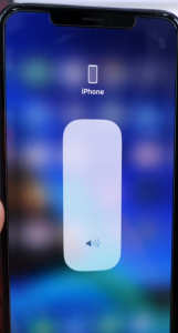
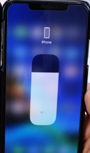
a) Volume: When you 3D Touch or Haptic Touch on the Volume Platter, you will notice that the volume icon is now much more bolder and you will also notice that the iPhone icon or Airpods icon or the icon of any other device connected to the iPhone for audio, has shrunk.
Beta 3, Source: EverythingApplePro
Beta 2, Source: EverythingApplePro
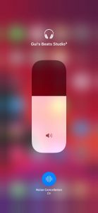
If you have your Beats Headphones with noise cancellation connected to your iPhone, there is a new option for noise cancellation right into the volume platter.
Source: 9to5Mac
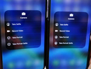
Also, If you 3D Touch or Haptic Touch on the camera platter, there is a new Icon for “Take Portrait Selfie” .
Source: everythingapplepro
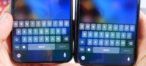
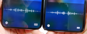
3. Keyboard: In the Keyboard, the dictation icon has become larger and when you tap on it, the returning to the keyboard icon has also become larger and more distinctive.
Beta 3 on the left, Beta 2 on the right,
Source: everythingapplepro
4. Screenshots:
a) Supported 3rd Party Browsers now get support for Full Screen Screenshots.
b) The look of the tab above the screenshot which gave us options for “Screen” and “Full Page” has changed. Here is how it looks:
Beta 3 on the left, Beta 2 on the right,
Source: everythingapplepro
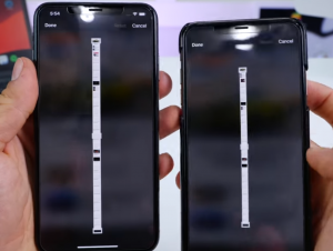
c) The cropping page interface of the full screen screenshots is much longer. This helps in cropping longer websites
Beta 3 on the left, Beta 2 on the right,
Source: everythingapplepro
d) Delete option: The Delete option now actually works in Beta 3, whereas in Beta 2, it was grayed out
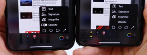
e) Bolder icon for the Editing Tools: The editing tool icon which looks like a color picker is now bigger and bolder. Also, there is a new Icon for Opacity. Earlier in Beta 2, there was no icon at all.
Beta 3 on the left, Beta 2 on the right,
Source: everythingapplepro
5. App Store: The Arcade tab on the App store has a cool new video running. It tells us that 100+ games are going to be in Apple Arcade and It’s going to launch in the fall. Earlier in Beta 2, it just used to say Coming Soon.
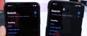
6. Search Bars: When Dark Mode in enabled, the Search Bars in the Settings App, App Store, etc are not distinctive. It blends with the Black background. It is still interactive when you tap on it.
Beta 3 on the left, Beta 2 on the right,
Source: everythingapplepro
7. Messages:
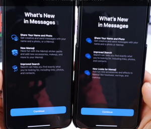
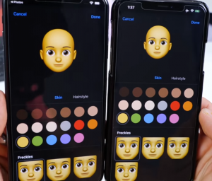
a)There is a new Splash screen in Beta 3, and clicking on continue will no longer ask you whether you want to Set Memoji or not. Instead, it will take you directly to Memoji. Also, the Memojis are now bigger, and it takes full advantage of the extra space on your screen.
Beta 3 on the left, Beta 2 on the right,
Source: everythingapplepro
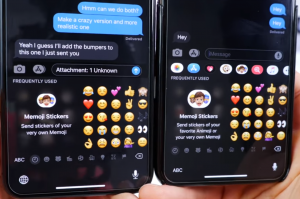
b)There is a new and short introductory Information about Memoji Stickers in the Memoji Sticker tab.
Beta 3 on the left, Beta 2 on the right,
Source: everythingapplepro
c)When you leave the customizer in Memoji, there are two renamed options which are “Discard Changes” and “Keep Editing” . Earlier in Beta 2 it was “Discard” and “Cancel”.
Beta 3 on the left, Beta 2 on the right,
Source: everythingapplepro
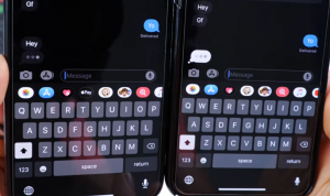
d)Another good change in Beta 3 is that when Dark Mode is enabled, the typing indicator is now also dark.
Beta 3 on the left, Beta 2 on the right,
Source: everythingapplepro
e) When you tap on More in Messages in Beta 3, you get one renamed option- “Manage Messages List” instead of “Select Messages”
f) While selecting an image in messages, the Delete icon is now larger than that of Beta 2.
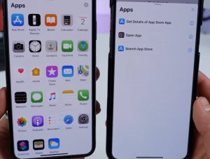
8. When setting an automation in Shortcuts, there is a new, pleasing and redesigned app drawer.
Beta 3 on the left, Beta 2 on the right,
Source: everythingapplepro
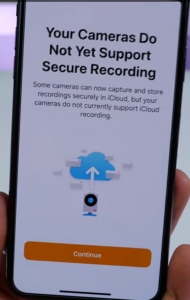
9. CCTV Camera: If you have a Camera setup with the Home App, which still does not support the Secure Recording Feature by Apple, there is a new Splash Screen when opening the Home App. If this feature is supported by your camera, the recording will go to iCloud, get decoded and will be shown in the Home App. With Secure Recording enabled, the recording will not go to the manufacturer, instead it will be decoded by iCloud which is safer.
Source: everythingapplepro
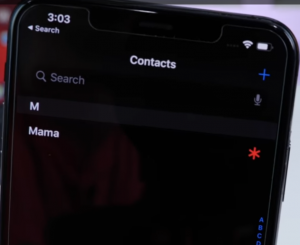
10. Emergency Contacts: If You have Emergency Contact Set Up for a particular contact, you will see a red star beside that contact in the Phone App or Contacts App. This indicates that the contact is an emergency contact.
Source: everythingapplepro
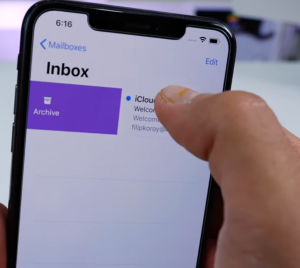
11. Mail: When you swipe to the right to Archive a Message, the color of the menu is now purple instead of blue.
Source: everythingapplepro
12. FaceTime: On the A12 and A12X chip devices, there is a new feature called “FaceTime Attention Correction”. If you are looking at the screen during a FaceTime call, this feature, if enabled, will automatically remap your eyes as if you are looking at the camera which will look more natural so now FaceTime calls aren’t going to be weird anymore.
13. Settings:
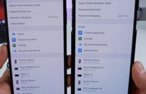
a)Apple ID and iCloud Settings: When you go to Settings>Your Name, you will notice that the iCloud icon is back and the subscription tab has been moved to the upper menu.
Beta 3 on the left, Beta 2 on the right,
Source: everythingapplepro
b) Wallpaper Settings: When you go to the Wallpaper Settings in the Settings App, the description for Dark Appearance Dims Wallpaper is not longer cut off.
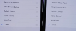
c)Check Mark in Settings: In the Settings App, the check Mark now looks bolder and bigger. For example, if you go to the Accessibility Shortcuts in Settings, and you start checking the items you require to work, you will notice that the check mark is brighter, bolder and bigger.
Beta 3 on the left, Beta 2 on the right,
Source: everythingapplepro
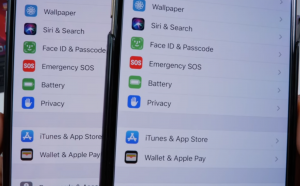
d)In Settings, the icons for the Texts – Face ID & Passcode and Battery, now has a deeper and richer green color.
e)Battery Settings: When you click on the suggestion for “Auto Brightness” , it no longer takes you to the Display Accomodations section. Instead it now opens a custom tailored page which has all the Display Settings in it.
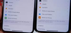
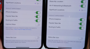
f) Privacy Settings: In the Privacy Section of Settings, we now have a new Icon for Motion and Fitness. Also when you go to System Services in the privacy Settings, you have a new option called “Improve Maps”
Beta 3 on the left, Beta 2 on the right,
Source: everythingapplepro
g) Safari: In the Safari Experimental Settings, there is a new option called “Synthetic Editing Commands”
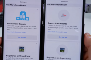
14. Health: The icon for “Access your Records” has been changed and the icon for “Register as an Organ Donor” is now larger.
Beta 3 on the left, Beta 2 on the right,
Source: everythingapplepro
15. Reminders: In the Reminders App, “Show Reminders as Overdue” option is now renamed to “Show as Overdue” and now it’s at the bottom.
16. Safari:
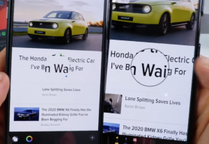
a)Markup: In the Safari Sharesheet, “Create PDF” has been renamed to “Markup”. Now whenever you tap on Markup, the Markup tools are already available by default. Earlier in Beta 2, you would have to click on the Pen icon to get the Markup Tools. Also, the Markup toolbar is no longer translucent. It has changed to a Matte Black Color so you can no longer see through them. Also, when you go to the Magnifier option in Markup, you will notice that the Magnifying interface no longer has a border. The toolbar options, which looks like a color picker is now bolder.
Beta 3 on the left, Beta 2 on the right,
Source: everythingapplepro
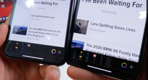
b)Scroll bar: Another small change in Safari is that the scroll bar is now grey instead of white so now it’s more distinctive.
c) Page Controls: When you tap on the Page Controls (Aa) on the top left, you will notice that the icon for Request Desktop Site is now more refined.
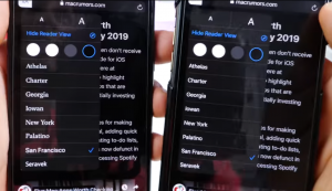
Also, if you go to Show Reader View, and the. Tap on Aa again, you will notice that the font name now actually represents their actual fonts.
Beta 3 on the left, Beta 2 on the right,
Source: everythingapplepro
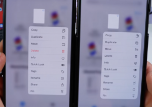
17. Files App: If you 3D Touch or Haptic Touch on a File, you will see that the Delete option is now Red in color, which means warning the user before deleting.
Beta 3 on the left, Beta 2 on the right,
Source: everythingapplepro
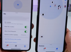
18. Find My: In the Find My App, there is a new tab called “Me”. In this tab, there will be options for location and Friend Requests.
Beta 3 on the left, Beta 2 on the right,
Source: everythingapplepro
19. Notes:
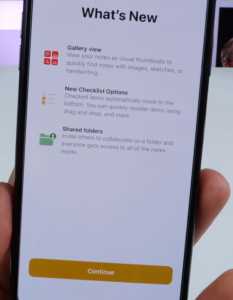
a) New Splash Screen
Source: everythingapplepro
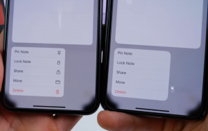
b) When you 3D Touch on a note, all the options have their respective icons which was not present in Beta 2.
Beta 3 on the left, Beta 2 on the right,
Source: everythingapplepro
20. Sharesheet in Photos:
a)In the Sharesheet for Photos, the Add to Album icon now has a new plus(+) sign on the bottom left of the icon.
b)The Create Watch Face option now has an Actual Watch icon next to it.
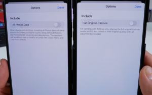
c) When you select on the options on the top of the share sheet, Full Original Capture in Beta 2 has been replaced by All Photos Data with a new description to it.
Beta 3 on the left, Beta 2 on the right,
Source: everythingapplepro
21. Wallet: When you launch the Wallet App, there is a new Splash screen called- “Apple Card & Privacy”.
22. Music: In Now Playing, the Volume slider has been fixed in Beta 3. Earlier in Beta 2, the slider would not go to the extreme right of the volume bar which caused a little low volume.
23. YouTube: The Double Volume Indicator in The YouTube App has been fixed in Beta 3. In Beta 2, when you were watching a video in landscape, and press on the volume buttons, there used to be a YouTube Volume bar and the stock iOS Volume Bar.
24. CarPlay: The CarPlay interface toggles are now more bolder and refined.
25. Screen Time: When an App is locked with Screen Time, there is a new option for Ok, which exits the App, and the ignore Limit option has now moved below the Ok button.
Changes Exclusively to the iPad:
1. In the Keyboard, the copy, redo and undo icons are now bolder.
2. When you are in Split screen, and you are switching windows, the slider bar on the top of each window has a subtle animation when you switch between them.
3. Mouse: We all know that we can use Mouse on the iPad, but now with Beta 3, you can change the cursor size.
4. Safari: In Safari, Holding on tab brings a new menu, and you have an option to close other tabs, which is in red.


