


Power. On another level.
This is iOS 13. A graphically enhanced operating system that can not only turn any device into a workstation – but also looks fluid too.
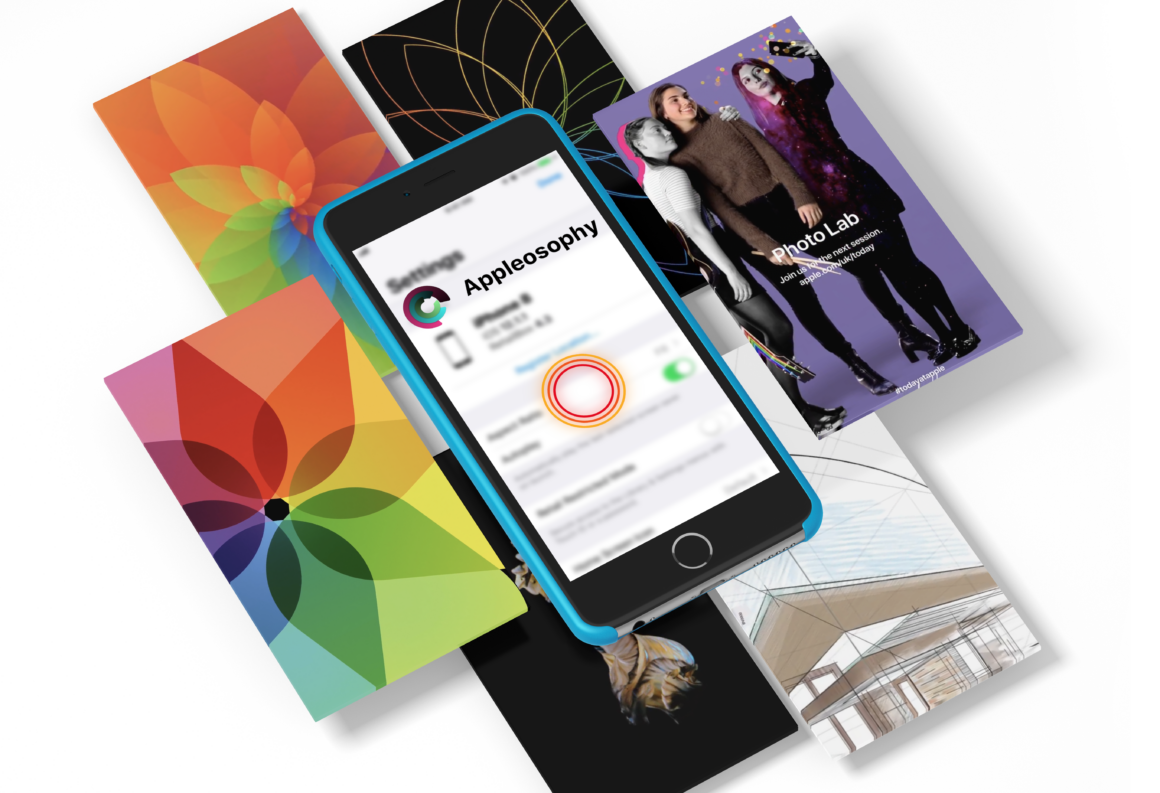
Appleosophy and Jadcepts have come together to think about what iOS 13 will look like. Will it be new and exciting? Will it bring more performance improvements? The ‘What’ in question was the whole basis of our concepts. We can say that both teams have worked in a coordinated spirit to visualize the concept of iOS 13 and what it will be like – practically speaking.Â
We wanted to make the iOS operating platform revolutionize how we use our phones, not just so we can say “there’s an app for that”, but that a user would have all the critical features you’d expect to be able to productively connect your other Apple products – right out of the box.
We focused this concept not only on graphical change, but also how Apple could improve their functionality of product integration. Jadcepts has worked really hard with us to try and visualize this ideology of trying to make this concept Apple-like while also trying to convey our idea of what we think should be added and changed. The use of a 2019-style iPhone with a smaller notch, also shows how there is always more room for more widgets and that a user should be able to make the screen real-estate theirs – with full customization for their needs.

The design looks quite cool, the wallpaper is nice and gives a clean and spacious appearance to the iPhone screen.
The concept of widgets has seemed great to me, I find it comfortable and useful; I have always thought that widgets on iOS do not have an effective use, it is certainly something in which iOS could learn one or two things from Android. In the concept of iOS 13 the widgets are very well taken advantage of, it allows to organize the icons of applications allowing the correct and minimalist functioning of the widgets. They do not seem intrusive to me at all, they mix very well with the ecosystem and the concept is very similar to what Apple would do if it decided to implement them in iOS 13.
Congratulations, the concept is very well achieved and even the widgets align perfectly with the iOS icons.
5/5 no doubt.
Ivan Silva – Apple Bandits
5/5
The music player (in our minds) needed a change. We made it a widget so music can easily be played from many different sources such as Spotify, SoundCloud or Apple Music. The controls are simplistic, as they are made to flow with the rest of the screen.Â
This concept is supposed to be for music listeners with AirPods or some from of wireless headphones to make changing music easy and confined just to the homescreen. Additionally, the music controls will still available on the Control Center.Â
We didn’t cover other aspects of iOS because we had a set objective of trying to show how the homescreen real-estate can be utilized.Â


0
Hours of work
After a longed wait of some form of iOS dark mode, we thought of bringing the dynamic theme of macOS to the iPhone. With this, OLED screens on the newest range of iPhones would be used to conserve energy while still being able to always display your latest notifications and other critical information such as battery percentage and our custom-designed music player.
This design is streamlined to show the full effect of how style cannot be compromised with functionality and still provides a user friendly way to interact with a device – even if it’s in a low-power state or just working as an always-on display.
We spent more than 72 hours, working and rendering this project
Our next focus was to see what else we would do to maximize how this magnificent OLED screen could be utilized.Â
The addition of control center notifications means that the same, common controls, are always accessible to the user, meaning a function can be executed quickly and instantaneously.Â
Apple Watch-like icons at the top of the screen also introduce the element of compact information, like on the watch, meaning things such as weather, messages and activity are all displayed on the homescreen. Without the need to swipe or open an app.


Download here

Real World Photos
Click the image to view it in full resolution. WordPress compresses these images, so we apologize for the quality.


Â
Â


@jadcepts

@appleosophy
https://www.youtube.com/watch?v=1llePoHRLgE