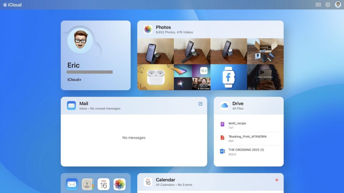
After several weeks of beta testing, Apple has finally rolled out a major redesign for its iCloud.com website, which is the home to all your digital media, documents, and email stored in iCloud. The homepage brings an entirely new experience that puts everything you can access at a glance.
When you go to the homepage, you’ll see a colorful wallpaper with several titles for both your Apple ID account and the essential apps such as iCloud Drive and Mail. Additional apps can also be added as a separate tile on the Home Screen for even quicker access.
Similar to the Home screen on both iOS and iPadOS, you can customize the homepage to your heart’s desire. By clicking the app’s icon on the top-right corner, you can add more apps that appear as a tile or remove tiles entirely. Additionally, clicking on the (+) icon provides quick actions to create a new document, note, calendar event, and so on. Finally, you can find additional settings, including iCloud+ features, by clicking on the profile icon. When you scroll down to the bottom of the homepage, you’ll find which plan you’re on, how much storage is used, and easily recover recently deleted files.
The all-new design for the iCloud.com homepage provides an unparalleled experience that will help iCloud users easily access their essential items online, even when they’re on a PC.


