


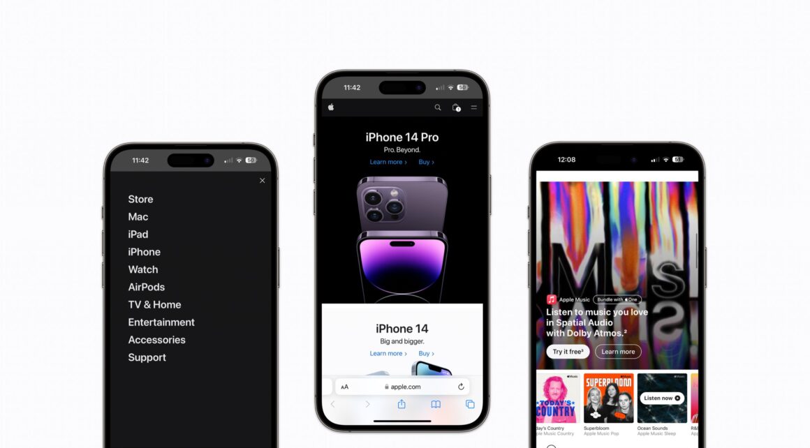
Today, Apple updated its website featuring design changes, improving readability with a bigger font size and less transparency on the Menu. The new menu now features a new category, “Entertainment”, to bundle all the latest releases that Apple and Content creators have focused on over the years.

The revamped website is more polished and easier to navigate, with menus that slide down upon selection. For example, hovering over the iPhone category reveals the various models available for purchase.
On the mobile version of the website, the Apple logo is now on the left instead of the center position that was previously taken, while the menu has moved to the right.

The new category “Entertainment” replaces “Only on Apple” and features the latest shows from Apple TV+, Apple Music playlists & new albums, Top games on Apple Arcade, Top classes on Apple Fitness+, featured Podcasts, Apple News, and Apple Books.
You can see that these changes are more evident on mobile devices, as well as on desktop devices. You can look at the redesign on www.apple.com.
What do you think of Apple’s new website design? Let us know in the comments below. If you like this article and want more Apple-related stories, make sure to follow us on @Appleosophy on Instagram and Twitter.


