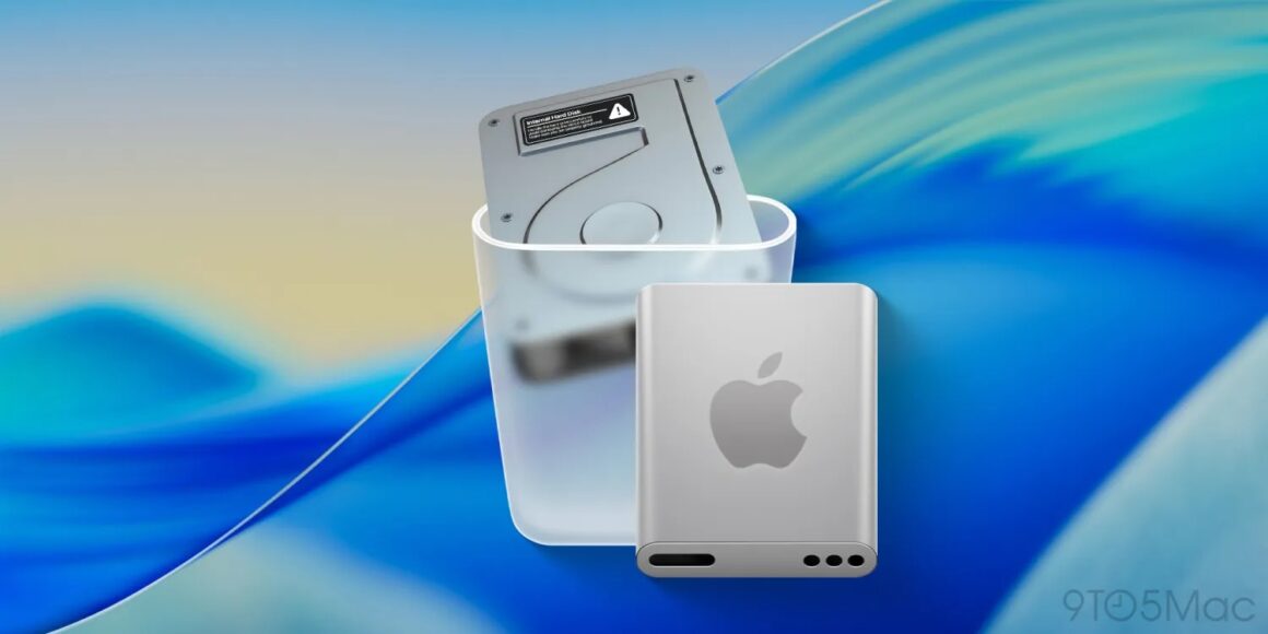
As you may know, Apple launched the fifth developer beta of macOS Tahoe, and for one of the changes, Apple finally updated the iconic Macintosh HD icon to a more modern one to reflect the usage of SSDs as the current internal storage solution for Macs. The existing icon resembles a traditional, mechanical hard drive with a warning icon sticker, but the new icon resembles a sleeker SSD encased in a rounded aluminum enclosure with a big Apple logo on top of it.
To tell you some history, Apple started using solid-state flash storage starting with the iPod shuffle/nano in 2005, and over the next few years, Apple would use this technology for iPhones and iPads. In 2008, Apple introduced the very first MacBook Air, and at the same time, this machine had an optional SSD configuration that was priced way higher; because SSDs were very expensive back then, MacBook Air came with a smaller, traditional hard drive that was also used in the iPod classic, and due to the lower 4200 RPM (revolutions per minute), it really felt like a slog performing normal, every day tasks.
But that all changed in 2010. Inspired by the leading innovations of iPad, the redesigned MacBook Air made solid-state storage standard, and the benefits were huge: faster boot-up/load speeds and improved reliability (less prone to failures). Soon after, the MacBook Pro, Mac Pro, Mac mini, and iMac all followed suit. Actually, in 2012, both the iMac and Mac mini had another storage option called the Fusion Drive, which was a stopgap, hybrid solution that combined both smaller SSD and larger HDD, but it wasn’t the best solution for importing or copying files between drives. By the end of 2021, Apple discontinued the antiquated “budget” 21.5-inch iMac as the last Mac that had a hard drive component since that used the Fusion Drive.
Now, I think it’s a good move for Apple to update its Mac icons to reflect the modern era. Another example was with the iTunes 10 icon in 2010 where the company finally ditched the “CD” image in anticipation of digital MP3 downloads outselling CDs in the music industry.
However, it seems some several users on X and Reddit have been really upset by this change, and this isn’t even the first time that Apple has received controversy over its revamped Mac icons as earlier betas of macOS Tahoe had the Finder icon with the reversed color scheme, with the light shade on the left and the dark on the right. After receiving backlash, Apple had to revert to the classic color arrangement that everyone has been accustomed to.
All companies will face backlash every now and then, and that’s what betas are for: users can address feedback for companies to listen, and since we’re currently in beta for macOS Tahoe, there’s still a possibility that the final icons may be different than what we have in beta. Regardless of what the final icons will look like, if you won’t like the new look, you can also manually change the look of the icons. We may give you a tutorial on how to do that soon, so stay tuned.


