Apple introduced the next major release of macOS and one of the biggest updates to the Mac in a few years, macOS Big Sur. After a month of using macOS Big Sur, here is my experience so far.
Design
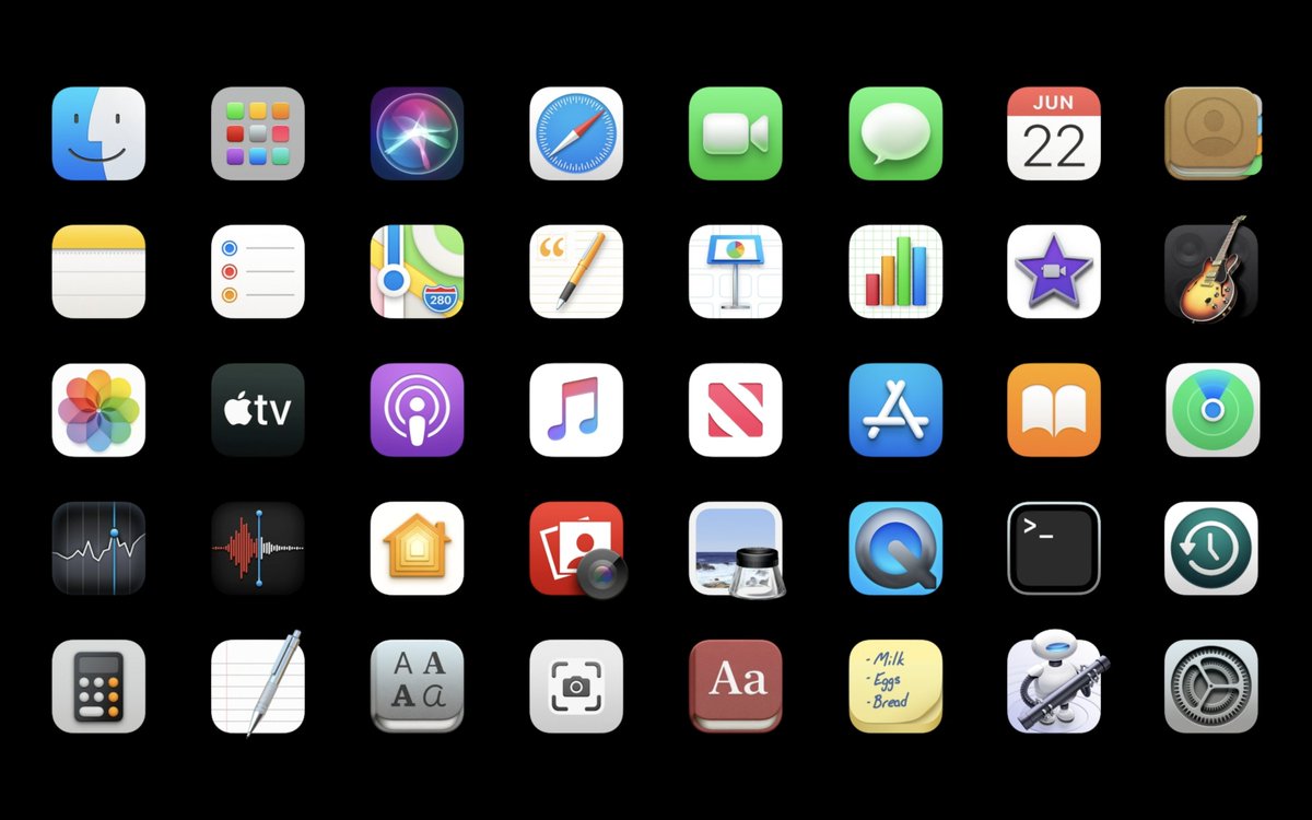
macOS Big Sur features a fresh new design introducing a look that is modern, consistent, familiar, and user friendly. The new rounded, transparent dock and slightly rounded icons follow the design of iPadOS & iOS 14. The menu bar is now translucent and blends into the background. The new menu bar is clean with many items now moved to the Control Center.
Safari
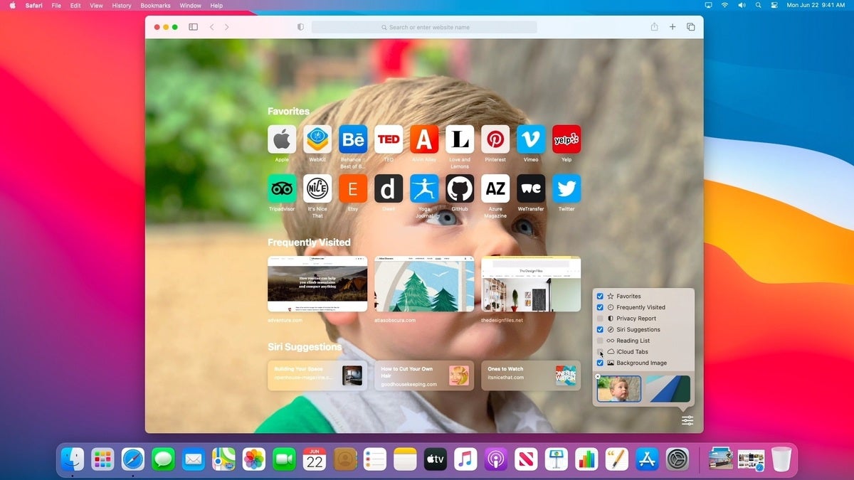
Safari in macOS Big Sur has been completely redesigned and it is now more focused on the user experience. Alongside a faster and more power-efficient experience in macOS Big Sur, the ability to further customize Safari makes daily use more efficient and easier to navigate. With a customizable start page for easy access to your favorite and frequently used pages, the new Safari is a game-changer.
Control Center
The addition of the Control Center in macOS is a welcome addition. Mac users can control many system functions in a common area that is similar to its iOS counterpart. Users can control volume, screen brightness, keyboard backlight, Bluetooth, Wi-Fi, and other functions directly from Control Center. You can even customize the Control Center through System Preferences with the ability to add and remove items and modules. Apple has also added the ability to toggle individual Control Center tools from the menu bar.

Notification Center
Similar to iOS 14’s new notification center, macOS Big Sur, combines widgets and notifications in a new page interface. Additionally macOS Big Sur introduces long overdue features from iOS and iPadOS such as grouped notifications and iMessage effects.
Widgets
Widgets in macOS Big Sur are similar to their iOS 14 counterparts and share the same Swift UI codebase. Widgets come in three different sizes (small, medium, & large) and they can be dragged around in the Notification Center to fit the individual needs of each user. Unfortunately widgets cannot be pinned or moved to the desktop, though this feature could be implemented in future releases of Big Sur.
After a month of using macOS Big Sur on my daily device, I’ve come to the conclusion that macOS Big Sur isn’t just a new release of macOS. It is a major step forward for the Mac with applications and tasks running more efficiently. Battery life has also increased with the system running even quicker than before.


