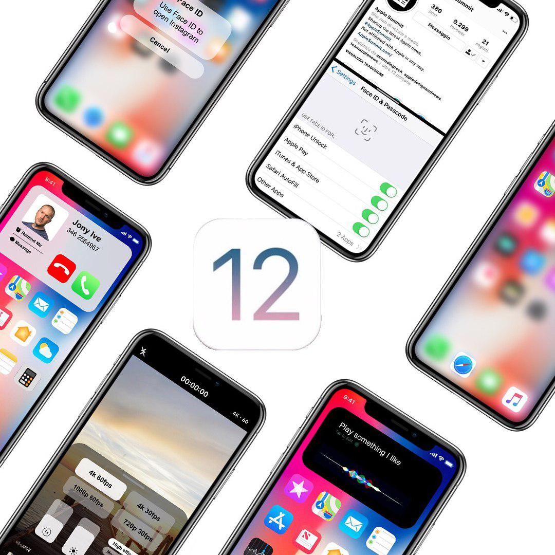
With WWDC 2018 only a week away, a lot of iOS 12 concepts have been released. Many are sleek and nice looking. However, some iOS 12 concepts are that but also unrealistic. The one I am about to show you is by @designbyappleincalifornia (Instagram). A very sleek and simplistic look while being organised and efficient.
A Less Intrusive Call System
As you can see from the first picture, the design for the notification of a call has changed. Now it is less intrusive and overwhelming while also taking less than half the screen space. With this sleek efficient looking design, you can see the person’s photo. That is if you added it within the contact’s information. You also have four options. You can either accept/decline the call or send them a pre-set or custom message. The last option is to remind you to call them in a set amount of time. In this concept, the notification for phone calls is designed well. It looks less cluttered and more organised. Also, it doesn’t take up the whole screen like the current design. This means you could also ignore the phone call and carry on with what you were doing.
Unlocking Applications with Face ID
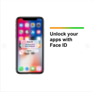
We all know on Android, you can lock your applications and use a fingerprint or passcode to unlock them. However, on iPhone you cannot do that. In this concept, we can see that applications are lockable. Then we can unlock them via Face ID. Locking apps is useful in order to hide something from others or it could be private information. Nevertheless, this concept of locking apps and unlocking using Face ID looks cool. Also, it would add more usefulness and functionality to Face ID. As present, all Face ID is useful for is for Apple Pay or installing apps or unlocking your iPhone.
Split-View Use of Applications
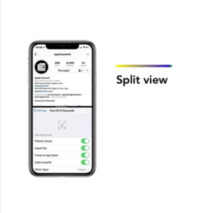
Wouldn’t it be great to be able to use two applications at the same time? Well this concept shows exactly that. As you can see from the image, Instagram is open at the top and Settings on the bottom. For years, Android users have had the opportunity to brag about split view tasking. Now, this year hopefully that feature is brought to iPhones. It is already available for iPads but not iPhones. How lovely wouldn’t it be to use two applications at once on that elegant, beautiful iPhone X display?
Guest Mode
Wouldn’t it be relieving knowing your friend or relative can’t access ‘important’ parts of your phone while using it? Well a guest mode would do exactly that. You could set up the guest mode so that only a few applications are available for use. And then you wouldn’t have to worry about your privacy being voided when someone other than you is using your phone. This guest mode would especially be useful for when kids play on your phone. Hopefully, iOS 12 will bring a guest mode as well.
Less-Intrusive Siri
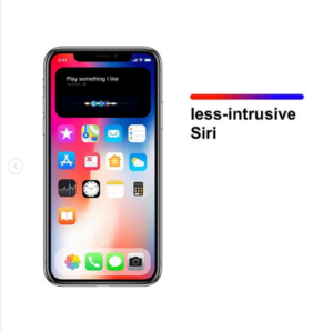
Isn’t it quite annoying when you accidentally hold on to the home button for too long and Siri launches? Or when you actually need to use Siri but also need to see something on your screen at the same time? Well this concept of a design for Siri that takes less than half of your screen space fixes that. This design for Siri is a lot sleeker looking, similarly to the phone call notification we saw earlier.
If you have any further questions or comments regarding the concept, feel free to leave them below or message @designbyappleincalifornia on Instagram!


