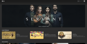
It’s the new year, and with it comes a fresh new look for the Apple TV+ website. Primarily used by those without access to a device compatible with native apps (eg. Windows PCs or Android phones) the website’s design now matches that of the Apple TV app. As Apple increasingly begins to rely on services like Apple Music and iCloud subscriptions, I find it odd that an Android app hasn’t been released for Apple TV+, despite Android having a native Apple Music app.
Despite this new update, the Apple TV+ website still falls behind compared to other, more established streaming services. Lacking a search bar, an Up Next queue and no support for auto-playing the next episode or skipping intros, it is frankly inexcusable for a streaming service with Apple’s credentials, launching all the way back in November 2019. Launched at exactly the same time, Apple’s web interface pales in comparison to Disney+, having a search bar (shocker), autoplay and intro skipping. Initially, this limited interface was excusable due to the lack of content, but as the service now hosts a plethora of titles, this website seems set to be more of a hindrance than a help.
This new update brings hope, however, for the future of the Apple TV+ website. Hopefully, these much-needed features make their way into future updates to the website, especially as Apple expands its media roster. With the much-anticipated ‘Cherry’ starring Tom Holland and directed by the Russo Brothers dropping on February 26th, and the recently announced ‘Kitbag’ starring the Oscar-winning Joaquin Phoenix, the service seems to be making leaps in improving its content selection. Let’s hope that the means to enjoy these productions are soon just as great as the titles themselves.


