Google seems to have finally given its iOS-version of YouTube some much-needed attention, as some UI elements in the YouTube app have recently changed for some users. Despite this, however, YouTube did remove Picture-in-Picture as an opt-in feature for premium subscribers last month, as outlined by David Becker in his recent review of the service. Do keep in mind that if you enabled PiP before it was removed and still have an active Premium subscription, you will still be able to access it for the duration of the subscription.
It is important to point out that these UI changes may roll out slowly, and you may encounter them disappearing after a while as well and reappear in waves. This seems to be due to YouTube releasing these changes over-the-air to some users in certain regions, therefore be patient and you may get them as well if you’re lucky enough. Note that they should be pushed automatically as these changes usually don’t appear in App Store updates.
The New YouTube Changes
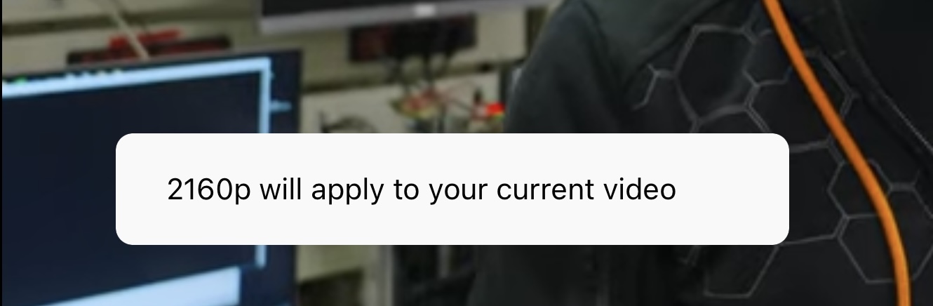
When changing video settings in the media player, the changes appear in a new redesigned prompt instead of an outdated “Android-style” one. This is most likely to make the app fit into the new Material You design language on all platforms. It is plain and simply is more appealing to the eye, modern as well.

The media player really seems to be the one that has gotten the most changes in this update, but this is likely where you’re going to spend most of your time anyway. Liking a video has been moved away from the “swipe-up” that it was in before and is now present with the controls that appear after you click the screen once. Here you can also see a new “More videos” button, which makes the “swipe-up” panel more accessible. It’s always nice to see changes that make gestures less needed! There is also no “peeking” showing a cropped version of this panel at the bottom of your media player anymore.

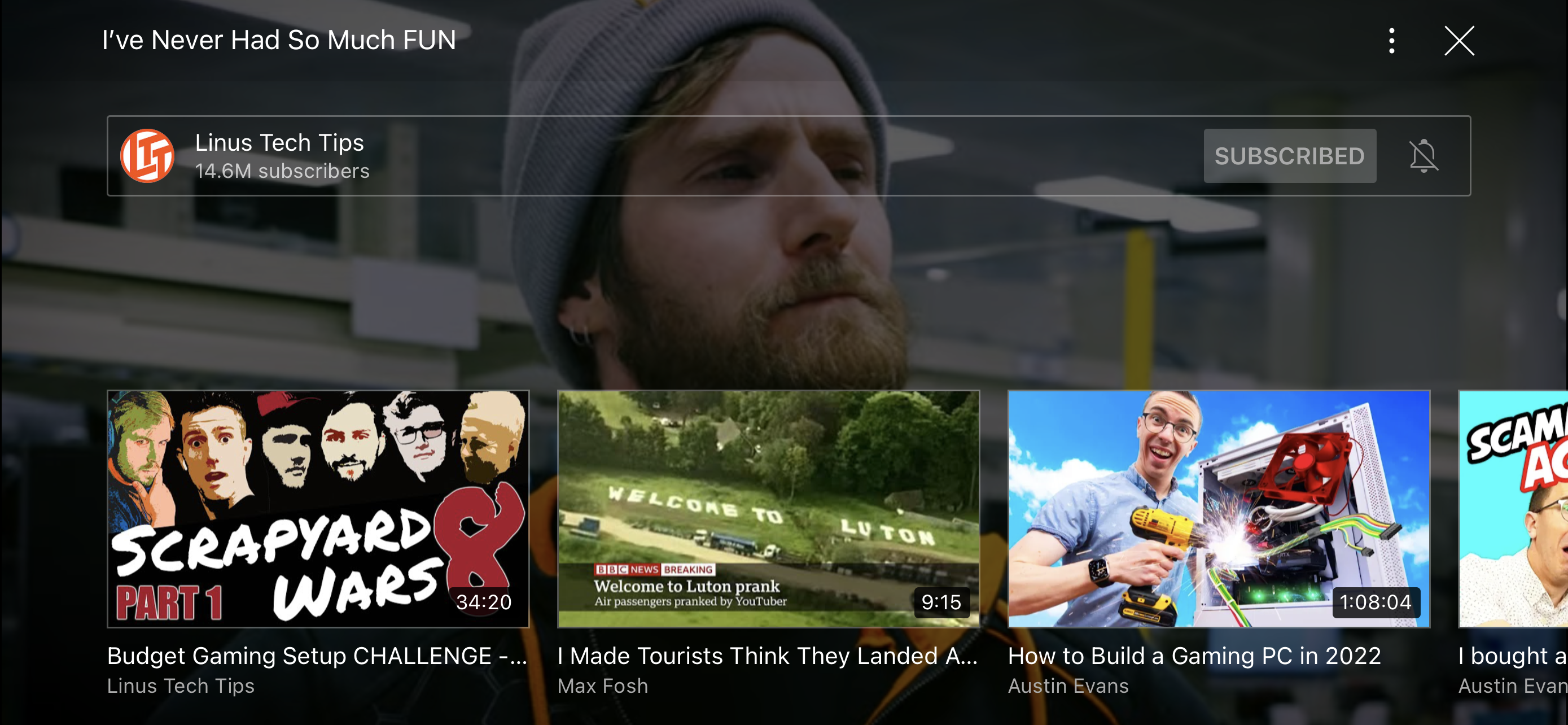
As Pururaj Dutta has noted in his tweet, there is also a new graph function. This allows viewers to see which part of a video has been viewed the most. There is also a “Most replayed” section for the parts that have been watched the most.
New #YouTube Feature: They have added a graph to the slider of the videos to represent the sections of the video that were played more and sections that were played less. As you can see- “Most replayed” is mentioned in the start of this video on YouTube by â¦@Mrwhosethebossâ© pic.twitter.com/hhuf0ShTY3
— Pururaj Dutta?⌚ï¸? #CES2023 (@pururajdutta) May 26, 2022
All in all, these changes appear more uniform with what I think YouTube should look like in this day and age, and it is certainly more appealing looking at it from a design and accessibility perspective. Do you like the new changes and want them to stick around? Tell us on Twitter at @Appleosophy.