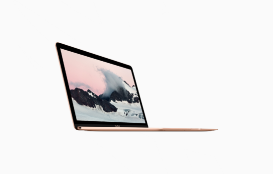
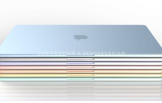
If you ever own a MacBook, you may have realized that the display has a 16:10 aspect ratio, which has been the standard for MacBooks for years. But some of the earlier Mac notebooks in history didn’t feature this common aspect ratio.
Let’s start with the original laptop computers from Apple – the PowerBook 100, 140, 170. All three models featured a display that’s 640 by 400 pixels. The resolution could be considered a 16:10 aspect ratio, but it’s also so very low compared to the higher-resolution displays we’re used to today. Later models such as the PowerBook 500 series featured larger and taller screens with a 4:3 aspect ratio, which was mainstream across desktop monitors back then.
On January 9, 2001, Apple introduced the PowerBook G4 Titanium, which featured a 15.2-inch “mega-wide” screen with a 3:2 aspect ratio. This was a milestone product where Apple pioneered a widescreen display on a notebook with a resolution that’s high enough to have two documents side-by-side. Desktop monitors and all-in-ones would later adopt widescreen displays such as the Cinema Display series. Two years later, Apple took another leap forward for its laptop lineup by offering the world’s first 17-inch notebook computer – the 17-inch PowerBook, which featured a 16:10 aspect ratio. That display was also used in the iMac when Apple introduced the 17-inch model back in July 2002.

While the larger models in Apple’s lineup featured widescreen displays, the smaller ones – the iBook and 12-inch PowerBook had stuck with 4:3 displays for some time. In 2006, Apple made the transition from PowerPC to Intel, and they replace both of those models with the widely-acclaimed MacBook, which adopted the 13.3-inch 16:10 screen and effectively made the aspect ratio standard across all of the laptops Apple had shipped.
Many years went by, and things changed. With the higher demand for high-definition televisions, desktop monitors and laptops moved to 16:9 displays. Although they were perfect for watching movies and television shows, they came with a downside. The 16:9 aspect ratio would mean less vertical space for your windows. This is detrimental for average users, especially coders since they would see fewer lines of page content and code.
Unfortunately, Apple had offered a laptop with a 16:9 aspect ratio – the 11″ MacBook Air from 2010 until 2016. Thankfully, Apple was wise enough to keep the 16:10 aspect ratio for the rest of their laptops moving forward, and we would be seeing other laptop manufacturers adopting taller screens once again such as Microsoft’s Surface lineup with the 3:2 displays. Just recently, Apple introduced the redesigned MacBooks with taller displays that incorporated the notch area that was implemented in a clever way. Those displays would give you the same 16:10 aspect ratio for the “main” workspace, but the notch area makes room for your Menu Bar, leaving you more vertical space.
As you can see, the aspect ratio is an important key factor for a laptop display beside the size and resolution, and the 16:10 aspect ratio is here to stay on Apple’s MacBook lineup. If you like this article and want more Apple-related stories, make sure you follow us on @Appleosophy.


