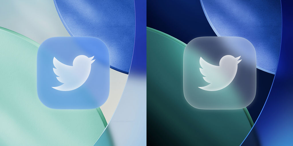
Apple’s Liquid Glass is Apple’s latest user interface design leap, unveiled at WWDC 2025. It’s the biggest visual overhaul to iOS and Apple’s other operating systems in over a decade, bringing a translucent, “glassy” look to everything from app icons to navigation menus. But Liquid Glass isn’t just about making your iPhone home screen icons shiny.
This new design language – a “material” that reflects and refracts its surroundings in real time – stands to change how we interact with our devices on multiple levels. From mobile gaming interfaces to reading on your phone and even cross-device experiences, Liquid Glass promises more “fun and magical” interactions (as Apple puts it) beyond cosmetic polish. Let’s explore how this fluid design could impact different aspects of our digital lives once iOS 26 (and its sister updates on iPad, Mac, Watch, and Apple TV) arrives.
Leveling Up Mobile Gaming: Liquid Glass and Online Video Poker
Mobile gaming is a massive market, and Apple knows it. iPhone users already drive a disproportionate share of app spending, so developers have strong incentive to leverage new iOS features, especially those investing heavily in better user interfaces. Modern online video poker games, in particular, stand to gain from Liquid Glass’s visual and interactive upgrades. Why video poker? This popular genre – part of an online poker market valued around $5.3 billion in 2024 – relies heavily on a clean, engaging interface.
The game elements (cards, chips, buttons for betting or holding, etc.) are essentially a digital UI for a casino experience. Liquid Glass can make that interface more immersive and dynamic than ever. Consider the typical video poker app screen: you have a virtual card table, cards laid out, and various controls. With Liquid Glass, these controls and panels can be rendered as translucent glass-like overlays that “give way to content” – meaning they float above the game without completely blocking the view. For example, a “Deal” or “Bet” button could appear to be a frosted glass button sitting above the animated cards, letting you still see the cards underneath.
This keeps the focus on the cards (the content) while the controls are clearly there when needed. Apple’s design notes say that traditional interface bars can now shrink or morph dynamically: on iPhones, tab bars contract as you scroll to free up screen space for content, then expand again when you need them. Applied to a game, that might mean the betting menu or game options bar could minimize itself while you’re watching the cards play out, then smoothly pop back when you touch the screen for the next round.
Sharper Focus on Content: Reading and Everyday Apps
Liquid Glass also changes how everyday apps look, making your content the main focus. For example, in iOS 26, when you start scrolling, the tab bar at the bottom shrinks, so more of the screen is used to show your content. You’re no longer stuck with a chunky bar taking up screen space while you read.
The moment you need it – say you scroll back up or tap near the bottom – it smoothly expands again. This fluid contracting and expanding happens automatically, so the interface “gets out of the way” without you having to toggle anything. On iPads and Macs, sidebars in apps use a similar trick: they’ve become translucent panels that refract the content behind them and even reflect bits of your wallpaper, giving you a sense of context.
Now, it’s worth noting that such heavy use of transparency and layering needs to be done right. In early beta versions, not everything is perfect. Some reviewers have found that if the background content is busy, the new translucent panels can make things harder to read.

Apple will likely fine-tune these contrasts (or provide options to reduce transparency, as they’ve done in the past). The key is balancing that slick look with usability. After all, a glass UI should still be clear – both aesthetically and in terms of communicating information.
Closing Thoughts
We are almost certain that the majority of app developers will be eager to adapt their software to the upcoming Apple UI design changes. One reason is that the hardest part of the job has already been done by the Cupertino giant—so why not take advantage of that? And second, developers are constantly looking for new ways to come up with creative ideas, sometimes even asking their customers directly for suggestions. This is just one example, but there are several such posts on Instagram and Facebook where game developers ask their players to make suggestions on what to change in a slot game, poker game, or other titles:
View this post on Instagram
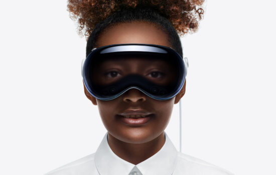
From technical perspectives, many tech observers see Liquid Glass as a hint of Apple’s future direction, possibly beyond traditional screens. The design itself was inspired by visionOS – the operating system for Apple’s AR/VR Vision Pro headset. In a sense, Apple is bringing some of the depth and dimensionality from the AR world into its 2D platforms. This could be laying the groundwork for something bigger. “This change could also hint at a potential future that could see Apple’s operating system and software extended to other surfaces besides phones, tablets, and watches — like AR glasses, perhaps”.


