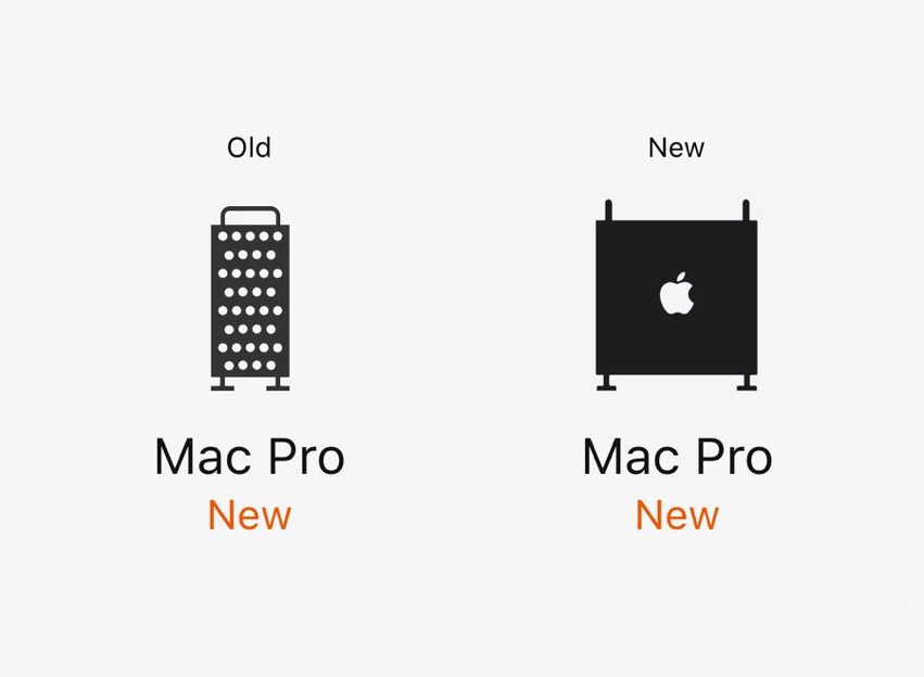
Apple has silently changed the icon for the 2019 Mac Pro on their website (via @st8rmi, Twitter).
As of June 2019, the icon was a front-facing view of the machine, which was, in many ways, mis-interpreted as a cheese grater, due to the holes and legs.
It’s now been made larger and far more visible to the eye, with a solid black side view featuring the Apple logo. You can check it out yourself, by going to the Mac page on Apple.com and looking at the devices section.


It’s the spindly handle and legs that make it look toylike too.
How about this?
This is a nice alteration. Thank you!